
TL;DR
Building real-time collaboration from scratch takes significant effort. You need sync logic, presence, comments, and infrastructure before you even ship the feature.
In this guide, we generate a pixel-perfect HackMD-style editor UI using Antigravity, connect live markdown preview in React, and then use Velt to add presence, live sync, and comments in just a few steps.
What We’re Building
We are building a HackMD style markdown editor with a clean two pane layout. On the left, users can write markdown. On the right, they see a live rendered preview. The interface follows a dark theme and mirrors the structure and layout of HackMD closely.
This is not just a static clone. The final result will support real time collaboration, allowing multiple users to edit, comment, and stay aware of each other inside the same document.
https://medium.com/media/489a0e6f72a0c016f6379d52dfd9d5a3/hrefTech Stack
We use a focused, minimal stack:
- React with Vite and TypeScript: Provides a fast development setup and a clean component-based architecture.
- Antigravity: Used to generate a pixel-accurate editor UI directly from a reference image. This allows us to replicate the layout precisely without manual design iteration.
- Velt React SDK: Adds the collaboration layer. We use it to enable presence, live state sync, and contextual comments without building real-time infrastructure from scratch.

Step 1: Generating a Pixel-Perfect UI with Antigravity
Antigravity is an AI-powered development platform and “agent-first” IDE where AI agents assist with coding tasks across your editor, terminal, and browser, moving beyond simple code completion toward autonomous execution of complex software workflows.
It lets you generate and modify real code based on high-level instructions, orchestrating planning, editing, and validation with minimal manual effort.
Why Use Antigravity?
Cloning an interface like HackMD manually is time-consuming. Matching spacing, typography, layout, and dark mode details takes careful iteration.
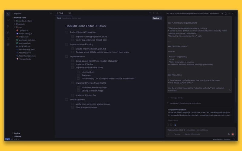
We used Antigravity to generate the editor UI directly from the reference image. The prompt enforced strict visual fidelity. No redesign. No interpretation.
This gave us:
- Rapid UI cloning: Full split layout with header, editor, preview, and status bar in minutes.
- Pixel-accurate output: Layout and styling matched the reference closely.
- No design drift: The UI stayed consistent with the original.
With the UI ready, we could move straight to functionality and collaboration.
The Prompt Strategy
The prompt was written with strict visual constraints. Every layout detail, spacing rule, and styling decision had to follow the reference image exactly.
We enforced a simple rule: the image always wins. If there was any conflict between best practice and the screenshot, the screenshot was treated as the authority.
You are an expert frontend engineer and UI pixel-perfect implementer.
Your task is to build **only the editor UI** of a HackMD-style markdown editor **exactly matching the provided image**. This is **not** a redesign, interpretation, or approximation. This must be a **visual and behavioral clone** of the image.
---
### CRITICAL INSTRUCTIONS (DO NOT IGNORE)
* **DO NOT make any assumptions** about layout, spacing, colors, typography, sizing, or behavior.
* **DO NOT invent UI elements** that are not visible in the image.
* **DO NOT omit UI elements** that are visible in the image.
* **DO NOT restyle or “improve” anything.**
* **DO NOT change colors, icons, padding, fonts, or alignment.**
* **DO NOT guess breakpoints** — infer responsiveness strictly from the image and standard proportional scaling.
* **Follow the image exactly as it is.** If something is unclear, replicate it as faithfully as possible from the visual evidence alone.
---
### INPUT CONTEXT
* You are working inside a **basic React project**.
* You are building **only the editor UI** (no authentication, no backend, no real GitHub integration).
* The editor consists of:
  * **Left pane**: Markdown editor
  * **Right pane**: Live markdown preview
* The provided image is the **single source of truth**.
---
### REQUIRED OUTPUT
Produce **production-ready React code** that recreates the UI **pixel-perfectly**.
You must:
1. Use **React functional components**
2. Use **CSS (or CSS Modules / styled-components)** to precisely match styles
3. Ensure the layout is **fully responsive** to all screen sizes while preserving proportions
4. Match:
   * Background colors
   * Pane widths
   * Divider behavior
   * Toolbar icons and placement
   * Font family, size, weight
   * Line height
   * Button styles
   * Hover/focus states (only if visible/implied)
   * Spacing and margins
5. Implement:
   * Markdown input on the left
   * Live preview rendering on the right
6. Match **dark mode styling exactly** as shown
7. Match scrollbar appearance as closely as possible
8. Use **no external UI libraries** unless strictly necessary for markdown parsing
9. Use semantic HTML where applicable
---
### LAYOUT REQUIREMENTS
* Two-column split layout
* Left: editable markdown text area
* Right: rendered markdown preview
* Divider exactly positioned as shown
* Toolbar at the top exactly matching icon order, spacing, and alignment
* Bottom GitHub buttons and template buttons must appear exactly as shown (visual only)
---
### RESPONSIVENESS REQUIREMENTS
* On smaller screens:
  * Maintain proportional scaling
  * Preserve visual hierarchy
  * Do NOT collapse, remove, or redesign panes unless explicitly shown in the image
* No mobile-specific UI unless clearly implied by the image
---
### FUNCTIONAL REQUIREMENTS
* Markdown typing updates preview in real time
* Toolbar buttons do NOT need real functionality unless explicitly visible
* GitHub buttons are **visual only**
* No routing, no persistence, no API calls
---
### DELIVERY FORMAT
* Return:
  * React component(s)
  * CSS
  * Brief explanation of structure
* Code must be clean, readable, and copy-paste ready
---
### FINAL RULE
If there is ever a conflict between best practices and the image:
**THE IMAGE ALWAYS WINS.**
Use the provided image as the **absolute authority** and replicate it **exactly**.
Generated Component Structure
Antigravity generated a clean, modular React structure instead of a single large file. The UI was split into focused components, each responsible for one section of the editor. This made the layout easy to reason about and ready for collaboration features.
- Header.tsx — Top navigation and toolbar
- Editor.tsx — Left pane markdown input
- Preview.tsx — Right pane rendered markdown
- StatusBar.tsx — Bottom metadata bar
- Layout.tsx — Structural wrapper composing the editor layout
This structure is accurate based on the repo you shared. It matches the actual src/components breakdown and reflects how the UI is assembled in App.tsx.

Implementing Markdown + Live Preview
The editor follows a simple two-pane model. The left pane is a controlled textarea where users write markdown. The right pane renders the parsed markdown in real time.
State is lifted to a shared parent component so that every keystroke updates both the editor and the preview instantly. This keeps the UI predictable and ensures the preview always reflects the latest content.

Step 2: Making the Editor Collaborative with Velt
Once the local markdown editor was working, the next step was to make it collaborative. Instead of building real-time infrastructure from scratch, we integrated Velt to handle sync, presence, and comments.
Why Use Velt?
Velt is a collaboration SDK that lets developers embed real-time collaboration features into web products quickly and efficiently. It provides fully managed components and backend support so you can add multiplayer-style experiences without building real-time infrastructure from scratch.
Key Features of Velt:
- Live Sync — Real-time shared state across users so everyone sees updates instantly.
- Comments — Contextual commenting components like those in Figma, Google Docs, and spreadsheet tools.
- Presence & Cursors — Shows active users and cursor positions in shared sessions.
- Multiplayer Editing — Multiple users can edit content concurrently with conflict resolution.
- Notifications — Built-in support for alerts and updates (mentions, replies).
- Recording & Huddles — audio/video/screen recording and in-app collaborative sessions.
- Customizable SDK — Components and behavior can be styled and extended to match your product.
Agent Skills and MCP Integration
Velt recently introduced Agent Skills and an implementation MCP that allow collaboration features to be integrated using AI agents. Instead of manually wiring presence, comments, and live sync, agents can now orchestrate much of the integration flow.
Installing & Setting Up Velt
We started by installing the Velt React SDK and adding it to the project. This gives us access to collaboration primitives such as live state, presence, and comments.
npm install @veltdev/react
# Optional: npm install --save-dev @veltdev/types
Next, we wrapped the root of the application with the Velt provider. This initializes the collaboration layer and connects the app to Velt using an API key.

From this point on, collaboration features can be layered into existing components without restructuring the entire application.
Since Velt also supports Agent Skills and MCP-based implementations in an agent-enabled environment, collaboration features can be scaffolded automatically, without manually wiring every component. The agent can configure provider setup, inject components, and connect live state with minimal manual steps.
In other words:
- Manual SDK setup → Explicit integration in code
- Agent Skills / MCP → AI-assisted integration with reduced setup effort
For this project, we used the manual SDK approach. But teams using agent driven workflows can accelerate collaboration integration even further.
Adding Text Comments
With Velt initialized, the next step was enabling inline comments inside the document.
We wrapped the editor layout with the VeltComments component in text mode. This attaches a collaborative comment layer directly to the markdown content without changing the editor’s internal logic.
- Contextual inline comments: Users can select text and leave feedback directly within the document.
- Anchored collaboration: Comments stay attached to specific sections even as content evolves.
- Multi-user discussion: Multiple users can comment and reply in the same document in real time.
At this point, the editor moves from being a single user tool to a shared workspace.
function App() {
  const apiKey = import.meta.env.VITE_VELT_API_KEY;
  const [currentUser, setCurrentUser] = useState(staticUsers[0]);
  const switchUser = (user: VeltUser) => {
    setCurrentUser(user);
    localStorage.setItem("hackmd-current-user", user.userId);
  };
  // Load user preference on app start
  useEffect(() => {
    const storedUserId = localStorage.getItem("hackmd-current-user");
    const user = storedUserId
      ? staticUsers.find((u) => u.userId === storedUserId) || staticUsers[0]
      : staticUsers[0];
    setCurrentUser(user);
  }, []);
  return (
    <VeltProvider apiKey={apiKey}>
      <VeltComments textMode={true} darkMode={true} />
      <AppContent
        currentUser={currentUser}
        staticUsers={staticUsers}
        onSwitchUser={switchUser}
      />
    </VeltProvider>
  );
}
export default App;
Enabling Live Sync
Comments make the document collaborative, but the content itself is still local. To enable true multi-user editing, we replaced local React state with Velt’s shared live state.
Instead of managing markdown with useState, we switched to useLiveState. This hook stores the document content in a shared real time layer managed by Velt.
Every update to the markdown now propagates instantly across connected users. No WebSockets, no manual sync logic, no conflict resolution setup.
The rest of the component structure remains unchanged. Only the state source is replaced.
- Multi user editing — Multiple users can type in the same document simultaneously.
- Instant shared updates — Changes appear in real time across all active sessions.
This is the moment where the editor becomes fully collaborative.
import React from 'react';
import { useLiveState } from '@veltdev/react';
import Header from './Header';
import Editor from './Editor';
import Preview from './Preview';
import StatusBar from './StatusBar';
import type { VeltUser } from '../types/veltUser';
import { defaultMarkdown } from '../constants/defaultTemplate';

interface LayoutProps {
    currentUser: VeltUser;
    staticUsers: VeltUser[];
    onSwitchUser: (user: VeltUser) => void;
}
const Layout: React.FC<LayoutProps> = ({ currentUser, staticUsers, onSwitchUser }) => {
    const [markdown, setMarkdown] = useLiveState<string>('hackmd-clone-markdown', defaultMarkdown);
    return (
        <div style={{
            display: 'flex',
            flexDirection: 'column',
            height: '100vh',
            width: '100vw',
            overflow: 'hidden'
        }}>
            <Header currentUser={currentUser} staticUsers={staticUsers} onSwitchUser={onSwitchUser} />
            <div style={{
                display: 'flex',
                flex: 1,
                overflow: 'hidden',
                position: 'relative'
            }}>
                <Editor value={markdown} onChange={setMarkdown} />
                <div style={{
                    width: '1px',
                    backgroundColor: '#000',
                    opacity: 0.3,
                    zIndex: 10
                }} />
                <Preview content={markdown} />
            </div>
            <StatusBar />
        </div>
    );
};
export default Layout;
Presence Awareness
Editing and commenting are core collaboration features, but presence adds awareness. It lets users see who else is currently active inside the document.
With Velt, presence is automatically tracked once the provider is configured. Active users can be identified in the session, enabling visual indicators such as avatars or active participant signals.
This creates a collaborative awareness layer. Users know when others are viewing or editing the same document, which reduces overlap and improves coordination.
import React, { useState } from 'react';
import { VeltPresence } from '@veltdev/react';
import type { VeltUser } from '../types/veltUser';
interface HeaderProps {
    currentUser: VeltUser;
    staticUsers: VeltUser[];
    onSwitchUser: (user: VeltUser) => void;
}
const Header: React.FC<HeaderProps> = ({ currentUser, staticUsers, onSwitchUser }) => {
    const [showUserMenu, setShowUserMenu] = useState(false);
    return (
        <div style={{
            height: 'var(--toolbar-height)',
            backgroundColor: '#2f3136', // Darker gray for toolbar
            display: 'flex',
            alignItems: 'center',
            justifyContent: 'space-between',
            padding: '0 16px',
            borderBottom: '1px solid #111',
            fontSize: '14px',
            color: '#b9bbbe'
        }}>
            {/* Left Section */}
            <div style={{ display: 'flex', alignItems: 'center', gap: '8px' }}>
                <div style={{
                    display: 'flex',
                    alignItems: 'center',
                    gap: '8px',
                    color: '#fff',
                    fontWeight: 600,
                    marginRight: '12px'
                }}>
                    <div style={{
                        width: '24px',
                        height: '24px',
                        borderRadius: '50%',
                        background: '#3370b7',
                        display: 'flex',
                        alignItems: 'center',
                        justifyContent: 'center'
                    }}>
                        <Power size={14} color="white" />
                    </div>
                    <span>My workspace</span>
                </div>
                <div style={{ width: '1px', height: '20px', background: '#4f545c', margin: '0 4px' }}></div>
                {/* Editor Mode Buttons */}
                <div style={{ display: 'flex', background: '#333', borderRadius: '4px', padding: '2px' }}>
                    <button style={{ padding: '4px 8px', background: '#444', borderRadius: '3px', color: '#fff' }}>
                        <Pencil size={14} />
                    </button>
                    <button style={{ padding: '4px 8px', color: '#888' }}>
                        <Columns size={14} />
                    </button>
                    <button style={{ padding: '4px 8px', color: '#888' }}>
                        <Eye size={14} />
                    </button>
                </div>
                <button style={{ padding: '4px' }}><Plus size={18} /></button>
                <button style={{ padding: '4px' }}><HelpCircle size={18} /></button>
                <button style={{ padding: '4px' }}><Search size={18} /></button>
            </div>
...
export default Header;
What We Didn’t Have to Build
Using Velt removed the need to build and maintain a complex collaboration infrastructure.
- No WebSocket layer for managing real-time connections
- No CRDT or conflict resolution system for concurrent edits
- No custom backend service for syncing document state
- No notification engine for mentions and updates
- No database layer for storing and anchoring comments
This allowed us to ship faster, reduce engineering overhead, and keep the codebase focused on core product functionality rather than infrastructure.
Try It Yourself
You can run the full demo locally and explore the collaborative features in action.
- Clone the repository
- Install dependencies
- Add your Velt API key
- Start the development server
Once running, open the app in two different browsers or devices. You will see live sync, comments, and presence working in real time.

Key Takeaways
Modern tooling changes how fast we can ship collaborative software. AI can drastically accelerate UI replication, allowing you to move from design to production-ready components in minutes. At the same time, collaboration infrastructure no longer needs to be built from scratch. By layering Velt on top of a clean React architecture, you can enable live sync, comments, and presence without managing real-time systems yourself.
If you’re building collaborative features into your product, explore Velt and see how quickly you can turn a single user interface into a shared workspace.
Resources
- Velt Documentation
- GitHub Repository
- Live Demo: Try the application yourself
Build a HackMD-Style Collaborative Markdown Editor with React, Antigravity IDE & Velt was originally published in Level Up Coding on Medium, where people are continuing the conversation by highlighting and responding to this story.